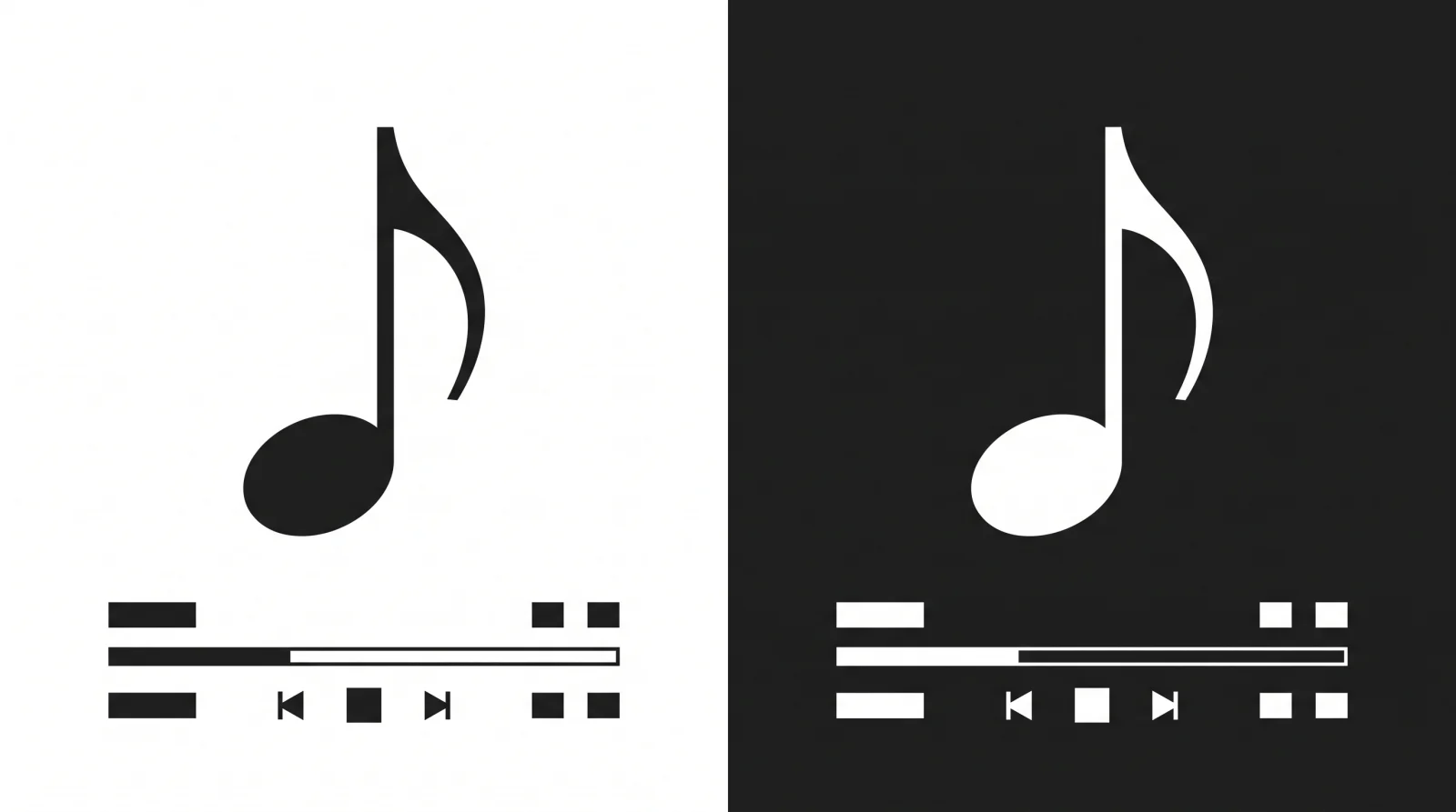
Apple has overhauled the Apple Music visual identity in the latest iOS 27.2 beta 4, replacing its long-standing vibrant red branding with a stark monochrome aesthetic. The update, released on October 13, 2026, marks the most significant departure from the service’s color palette since its launch in 2015.
The new app icon features a black music note on a white background in light mode and reverses to a white note on a black background in dark mode. Beyond the primary icon, the internal user interface has also seen a color transition; Apple has replaced the signature red navigation highlights and widget backgrounds with blue and black elements.

The design changes extend to the music note symbol itself. The note in the new logo is tilted further to the left than previous iterations and features more pronounced, oval-shaped bases. Additionally, the new branding incorporates a bold, lowercase “music” wordmark, a stylistic choice first seen at the recently opened Apple Music Hall at London’s Battersea Power Station.
A Shift in Brand Direction
The transition away from “Apple Music Red” appears to be part of a broader brand consolidation tied to the opening of the 600-capacity London venue. This new physical presence has set a precedent for a more minimalist, high-contrast visual language that is now migrating to the mobile application.
The monochrome shift provides a cleaner look that aligns with recent iOS personalization trends—including the “Clear” icon version that allows for user-defined tinting.
The change from red to blue accents is particularly notable, as the specific shade of red has been the primary identifier for the service for over a decade. In the beta version, these blue accents appear in the navigation bar and specific menu selections, signaling a potential permanent end to the red-dominated UI.
It remains unclear if these changes will be finalized for the public release of iOS 27.2 or if they will remain exclusive to the beta testing phase.